The votes are in! Thanks to everyone for your votes on the new podcast logo and your (hilarious and often quite vociferous) comments.
There was a very clear winner. Results below. But first, a huge, major, big-honkin’ shout out to the three designers who submitted logos: Julia Patterson, Kelsey Crockett, and Lauren Hicks.
Check out Lauren’s website and hit her up if you want her to do some design work for you!
Check out Kelsey’s website and hit her up if you want her to do some design work for you!
(Julia isn’t taking any new clients. Sorry!)
And now, the results…
|
Answer Choices
|
Responses
|
|---|---|
|
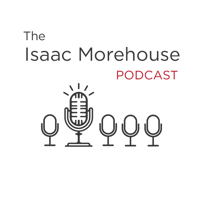
Logo 1 – Julia Patterson Mics
|
37.93%
|
|
Logo 2 – Julia Patterson Chain
|
13.79%
|
|
Logo 3 – Julia Patterson Head
|
19.54%
|
|
Logo 4 – Kelsey Crockett Dots
|
2.30%
|
|
Logo 5 – Kelsey Crockett Square
|
3.45%
|
|
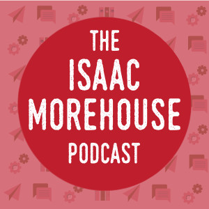
Logo 6 – Lauren Hicks Red/White
|
8.05%
|
|
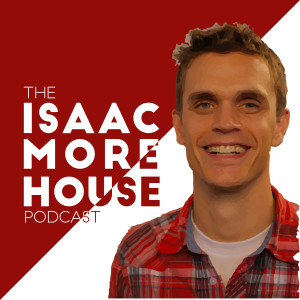
Logo 7 – Lauren Hicks Red/White with Picture
|
2.30%
|
|
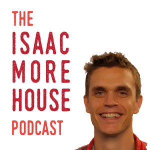
Logo 8 – Lauren Hicks White with Picture
|
5.75%
|
|
Logo 9 – Lauren Hicks Red
|
2.30%
|
|
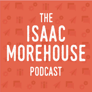
Logo 10 – Lauren Hicks Orange
|
4.60%
|
The landslide winner:
I like it. A lot. It’s simple, clean, clear yet a little mysterious, and I’m a huge fan of black on white. It also does a good job conveying the concept of standing out, being different, getting off the conveyor belt, and breaking the mold…or maybe it’s just supposed to represent me being really loud? Either way, it works.
Now I’ve got to figure out how to get it setup on SoundCloud, Stitcher, iTunes, etc…Look out for it soon!
